

When we think about making change, we have to imagine an alternate future for ourselves. That future is only realized through sacrifice. What are we doing differently?
American Trench boils our sacrifice down to three words: Made in America.
There is dignity in manufacturing. It can be seen in the towns that grew around factories, companies, and the ideas that formed them. The companies with whom we do business are community based and family owned. The people working in those factories have a career creating longer lasting, high quality goods. That aligns with our goal, to make goods with intention and create opportunity. And, that’s been the American Trench mission from day one.
The challenge is communicating that mission via branding: telling the story of what it is you do. Thinking back on the journey from company conception to their latest rebrand, American Trench co-founder Jacob Hurwitz reflects:
“We’ve always been about creating long lasting clothes within USA based manufacturing partners. We haven’t always done the best job talking about it.”
Chapter 1: The Sketch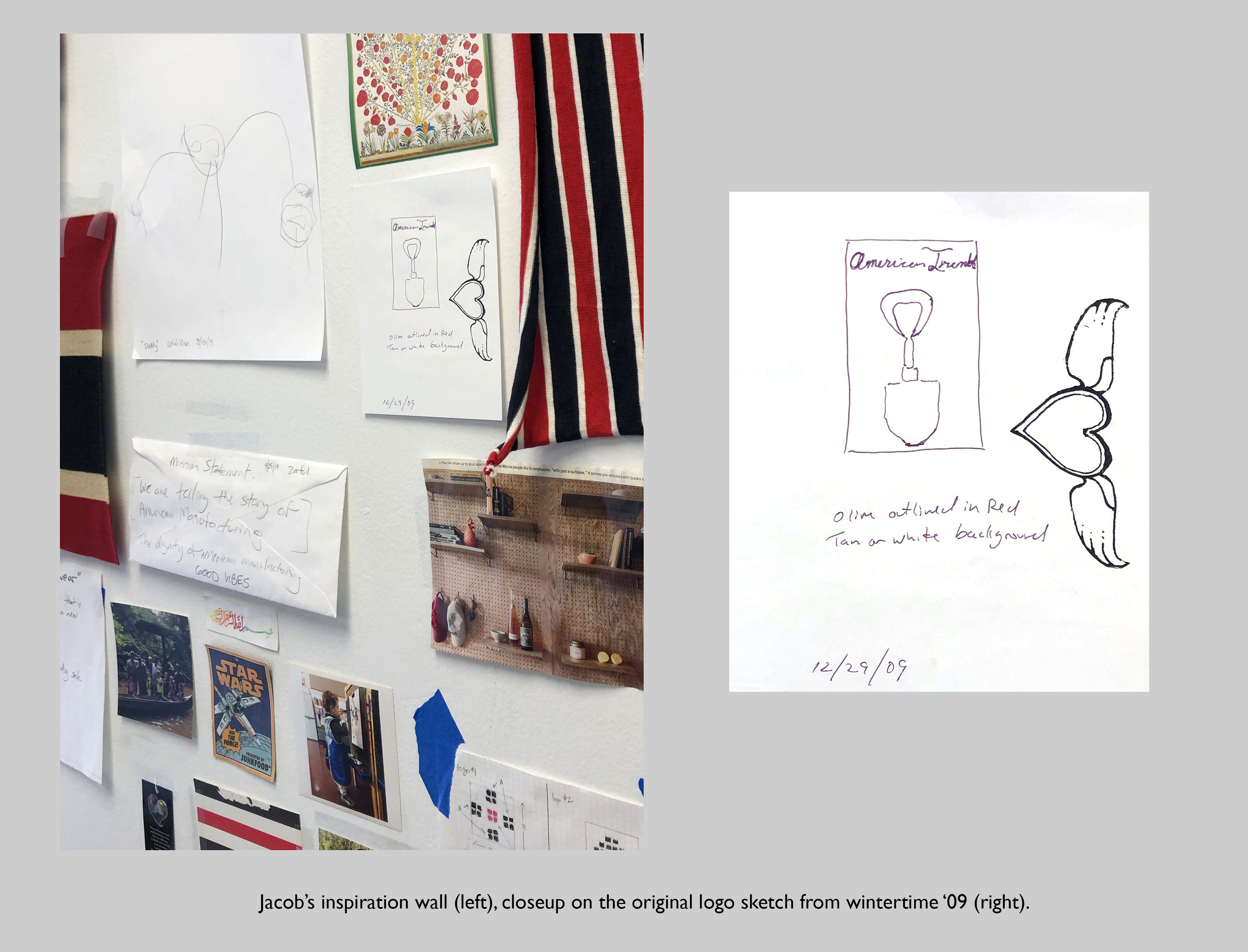
Inside Trench HQ, you’ll find a wall of in-season socks, a desk strewn with purchase orders, the floor, eschewed with samples and swatches. The wall behind Jacob’s desk, a poignant pot-pourri: hand drawn mock-ups of products-to-be, family pictures, magazine cut-outs of inspiration, swatches of the first ever textiles custom-knit for the brand. Off centered and understated on that wall, yet somehow paramount, it’s Trench genesis: The Shovel Sketch. It was the first sketch of our branding, scribbled on a piece of stationary, in the reverse orientation of the header graphic, a double lined heart with wings.
“Early on I tried to be very literal with the branding,” Jacob says of the sketch he drew, wintertime 2009. “We wanted to make trench coats, so a trench shovel just made sense.”
Three years after drawing that sketch, Jacob and co-founder David Neill sold the first version of The American Trench on Kickstarter. Call this chapter one. The shovel sketch is not so much a first draft as it is the prologue to the label that appeared on that original Kickstarter coat.
We are now in a closet, thrashing through clothes on hangers. It’s easy to be proud of a group of people so physically dedicated to their brand. Jacob and I scour the room for ghosts of branding past. He muls those first few years of brand existence as we comb through a drawer of deadstock tags. We find the tag from one of the original trench coats. The lining of the coat has a tag comfortably stitched into the top middle. There’s the shovel, and in olive print, the words “A M E R I C A N T R E N C H.” Below the shovel, a promise as much as it is mission-centric branding, “Made in the USA.”

“I remember being caught up on our font choice,” he says. “One thing I didn’t love about this version was I felt stuck using a font in all caps.”
We continue to hunt for more branding examples and the topic of change dominates the conversation. Any brand in any industry needs to honor their own history but also acknowledge the present. There is a cycle: grow, change, adapt. Repeat.
Chapter 2: Trench Tags

In 2014, the branding was updated. We introduced riders. Stickers. Loop Labels. Olive and tan were replaced with black, white, and a crimson red. The words “American Trench” are still all caps - but positioned beneath the Trench shovel icon. The shovel almost becomes an arrow, guiding eyes from the then logo to the name below.
Intentional or not, the Trench branding over the past few years was super shovel centric. Even the wrapping paper, used to pack bulkier, boxed shipments, includes a pattern of encircled trench shovels.

The shovel is simple, but limiting - both aesthetically and symbolically. It’s one dimensional. It’s hard, pointed, literal and blunt. It’s also very masculine and less inclusive in the context of womenswear or unisex garments. It was time to evolve and move past the literal.
Chapter 3

The decision to move to a more text-driven branding stemmed from that conversation to become intentionally less gendered. We were finally making clothes for all people - why was our icon still so specific?
We have an updated shovel but we also have a new set of text based logos. We’ve dived into the idea of using the leading “a” from american trench and also “at” from the two leading letters. These abbreviations feel right. They are just enough. The idea gets across.

Rhetorically, the new branding makes a key distinction in font size and style. “american trench” is lowercase - but MADE IN THE USA remains all tall. I think this reflects both our commitment to less explicit branding while also emphasizing our mission. The capital letters almost supersede our name. As if to say it's bigger than the brand. We’re less committed to the name we call ourselves than we are to our purpose.
In the past, American Trench did not commit to a singular font. Going beyond our branding, even our website had a plethora of incongruent display fonts. Peeking further under the re-brand hood, both pieces of text, “american trench” and “MADE IN USA,” are from the same font family. In fact, all of the text on our website is now from that same phylum. We have a set font that covers everything, from on product branding to product page copy bringing a sense of visual unity to our presentation.
These changes were made starting in the fall of 2020 and continuing in the spring of 2021. This is the third chapter of our brand(ing) story. We intend for this branding to be around for awhile, but at some point, it too will need a refresh. It’s all part of the cycle: grow, change, adapt, repeat.